Dubai’s streets are gaining a new visual language. Updated signs combine stronger colour coding, clearer bilingual directions and QR codes that connect roadside information with digital services. The aim is simple but important: help drivers, pedestrians, residents and visitors understand the city faster as Dubai continues to expand.
The road is glowing after sunset. Headlights stream beneath the towers, taxis slip between lanes and a visitor checks the next exit one more time. Then a new sign appears above the traffic: crisp lettering, a clear arrow and a flash of colour. Beside it sits a QR code, waiting quietly for a phone.
Dubai is refreshing its street-sign system. At first glance, it looks like a design update. On closer inspection, it is a practical response to a city that keeps changing. New districts emerge, roads widen, landmarks gain additional entrances and a familiar journey can suddenly require a different turn.
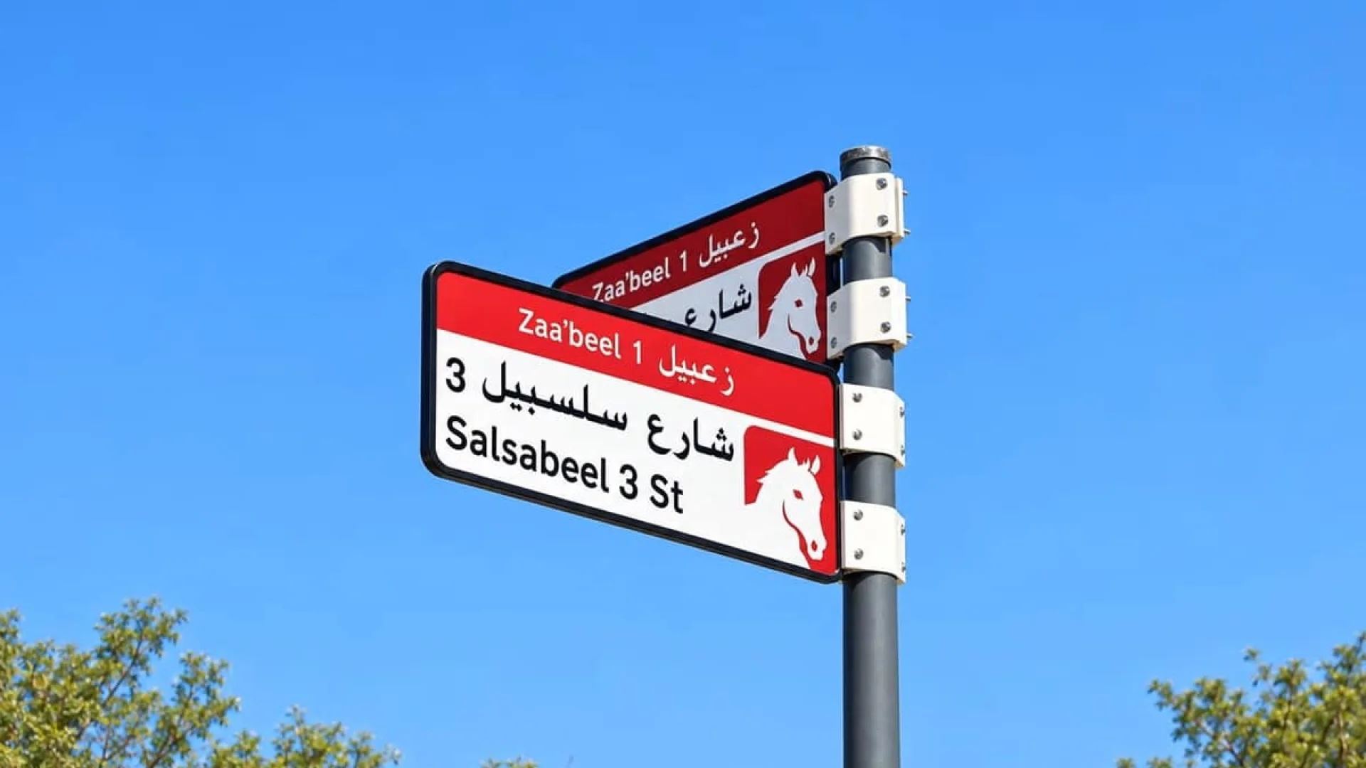
The new signs make colour a more visible part of navigation. Different colours help separate layers of information and make routes easier to recognise at a glance. Instead of reading every word on a crowded sign, road users can first identify the visual category, then confirm the destination and direction.
That matters in Dubai. A single journey can pass a motorway, a residential community, a hotel district and a shopping destination within minutes. When traffic is heavy, there is little time to decode a complicated sign. Colour creates a quick visual anchor. It does not replace names or arrows. It helps the eye find them.
“Is this my exit?” It is a small question with expensive consequences. Miss one turn and a short drive can become a long loop. The redesigned signs are intended to reduce that uncertainty by presenting destinations, road numbers and directions in a more structured way.
Arabic and English remain at the heart of Dubai’s public wayfinding. The two languages appear together, serving local residents and the international population that moves through the emirate every day. But bilingual design is more than translation. It is also spacing, scale and timing.
A sign must be readable from a moving vehicle, sometimes at night and often while several lanes are competing for attention. The best information is not the information that fills the most space. It is the information the eye can understand immediately.
The QR code adds a digital layer to the physical road. A person who is walking, waiting or safely parked can scan it to access further location or route information. A sign that once ended with a destination name can now lead to a broader digital experience.
This can be particularly useful for visitors. A district may contain several towers with similar names. A hotel may have more than one access road. A landmark can be easier to recognise on a map than through a brief roadside label. Digital information can provide the missing context: where the destination sits, how to approach it and what lies nearby.
The principle is straightforward. The sign answers the immediate question: “Where do I go?” The phone can answer the next one: “What exactly is there, and how do I reach it?”
Wayfinding rarely produces the drama of a new tower or a major transport project. Yet it shapes everyday life. A clear arrow can calm a nervous driver. A readable district name can save a delivery driver time. A digital link can help a first-time visitor feel less like a stranger in a vast city.
The real test is not one sign in isolation. It is the sequence. First comes the district. Then the main road. Then the exit. Finally, the building or destination. Effective wayfinding tells that story in a few seconds and gives the driver confidence at every step.
Dubai is often described through its skyline. Towers, bridges and illuminated façades dominate the visual identity of the emirate. But a city is also understood through its quieter systems: the arrows, numbers and names that guide people through it.
The updated signs make the urban network easier to read. Colours organise information. Bilingual layouts widen access. QR codes connect the street to the digital map already carried by millions of people. Together, they create a bridge between the physical city and the mobile city.
That bridge is becoming essential. Residents expect instant information. Visitors arrive with phones in hand. Businesses need customers to find them. New communities need to be visible and reachable. A modern sign therefore does more than point left or right. It helps a fast-growing city explain itself.
There is something quietly impressive about that change. No new skyline appears overnight. Instead, a familiar junction becomes less confusing. A colour becomes easier to recognise. A small code opens a wider map. Urban progress often happens exactly this way: through modest details that improve thousands of journeys every day.
Accessibility is a powerful, if sometimes overlooked, real estate factor. A residential building, office or hotel gains practical value when people can find it quickly and reach it without stress. Clear wayfinding can strengthen the perceived accessibility of a location, especially for international buyers, tenants and visitors who are unfamiliar with Dubai’s road network.
For emerging communities, better signs can reinforce the connection between major roads, public facilities, retail destinations and individual developments. That connection contributes to how a neighbourhood is experienced. Investors look not only at a building’s architecture, but also at how naturally it fits into the wider urban network.
The QR layer points to another shift in the property journey. Potential buyers and tenants increasingly discover places while travelling through the city. If a physical sign can lead to maps, building information and nearby services, the path from visibility to interest becomes shorter and more digital.